Rodan + Fields Convention only happens once a year and for their Consultants, it’s a pretty big deal.
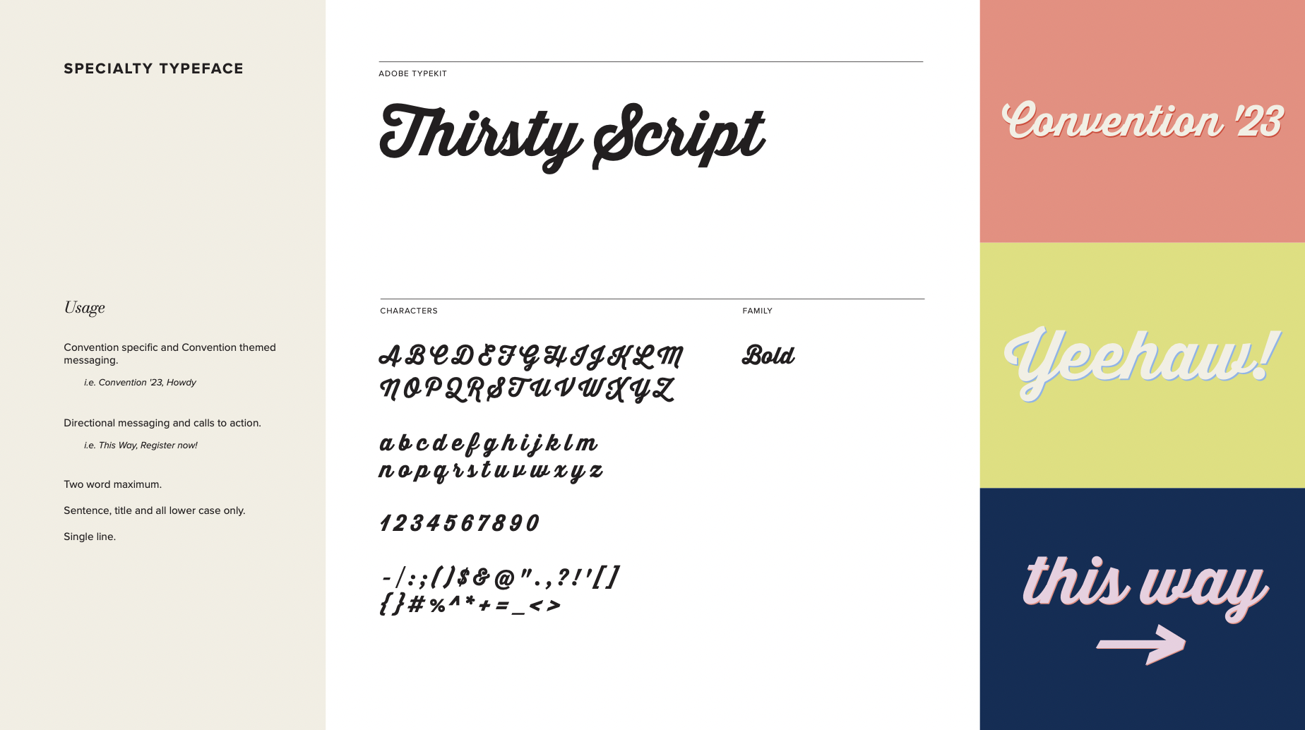
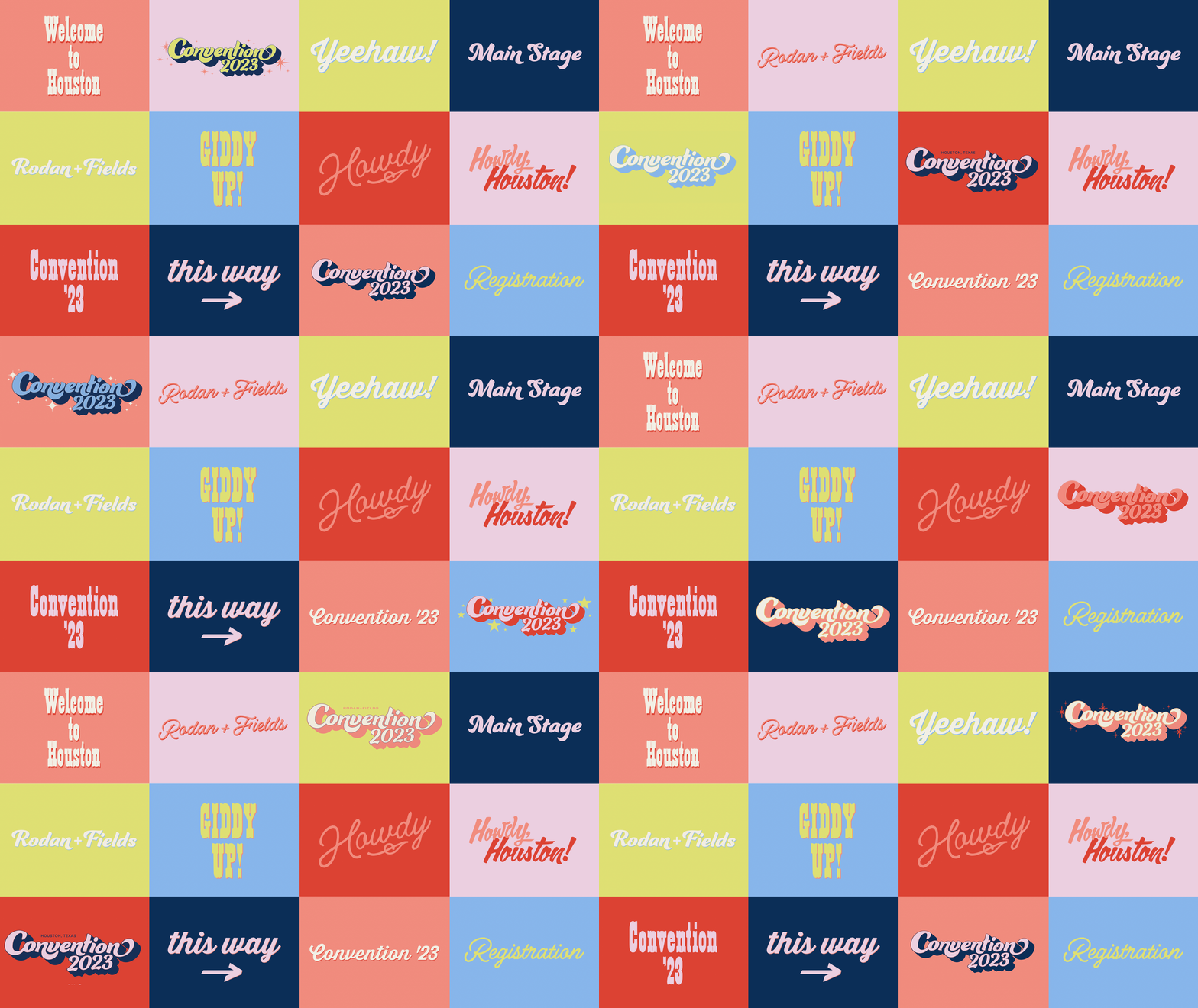
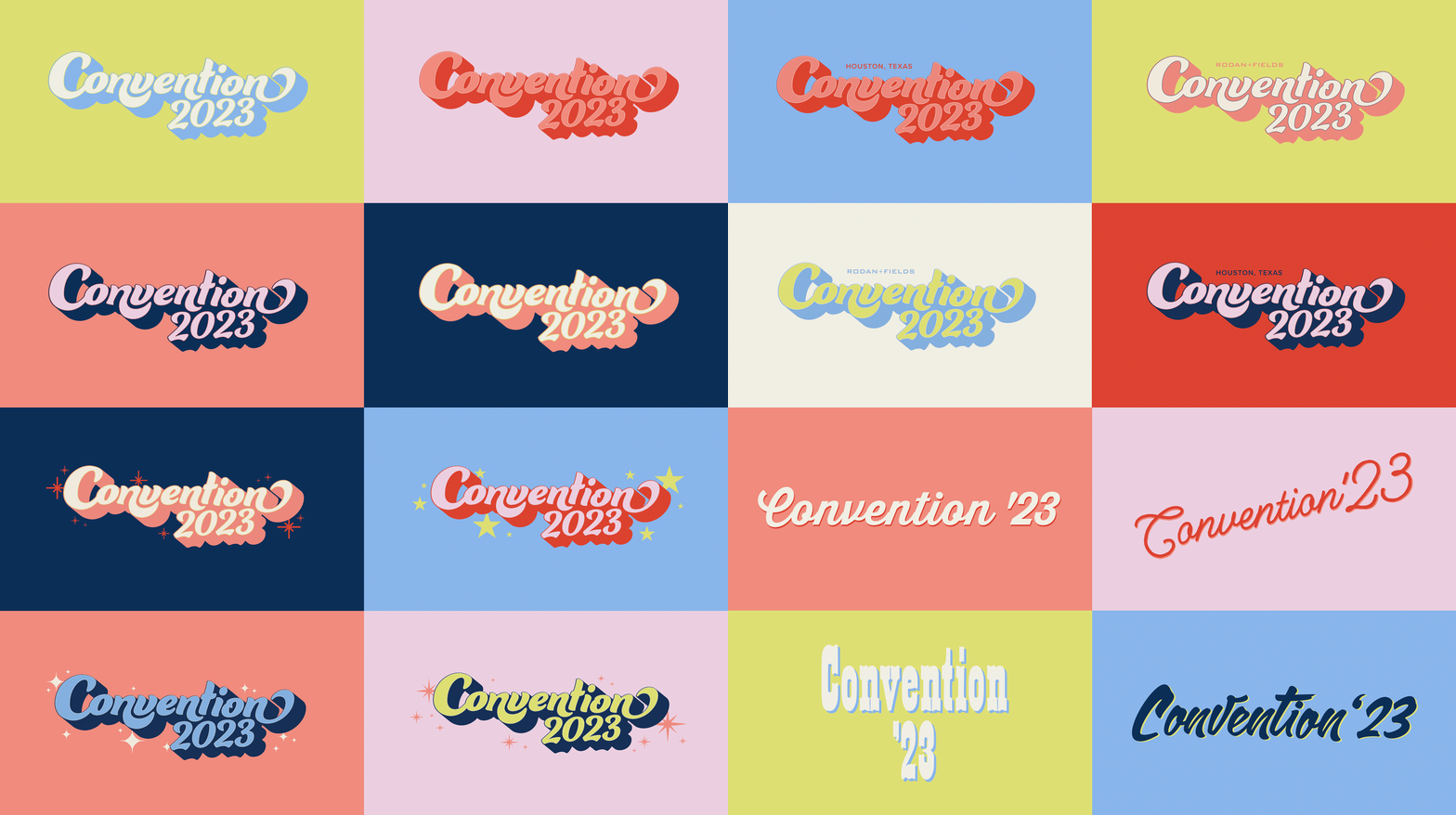
To make each year feel special, we’re giving Convention ’23 a look + feel wholly its own with memorable and unique design elements normally not seen in typical R+F branding.
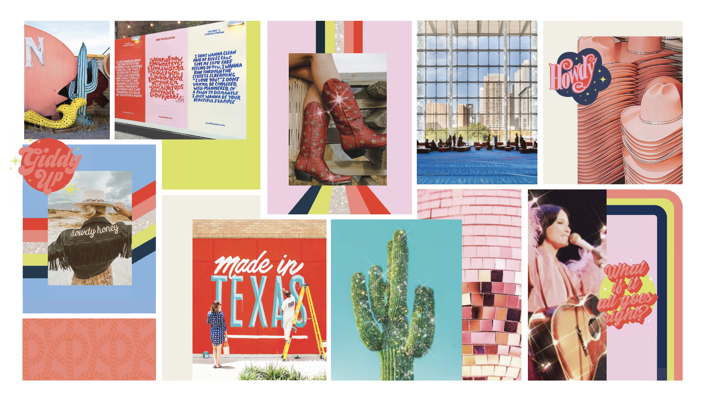
Texas is big, bold, loud + proud. And so are we. This year we’re not just leaning into having a little more fun, we’re jumping, cowboy boots first, into exciting, colorful, exuberant branding moments inspired by the energy our Consultants bring each year.
Bold + bright color, fresh graphics + type treatments, a (big) dash of glitter, and a whole lot of fun. This is a new kind of Convention that our Consultants will remember for years to come.
SCOPE
Brand Strategy
Creative Direction
Digital Marketing
Experience & Event Design
Iconography
Illustrations & Graphics
Market & Competitive Research
Photo & Video Art Direction
Presentations
Print & Signage
Social
Visual Identity
Website UI/UX



How might we make red, white and blue not feel so…red, white and blue.
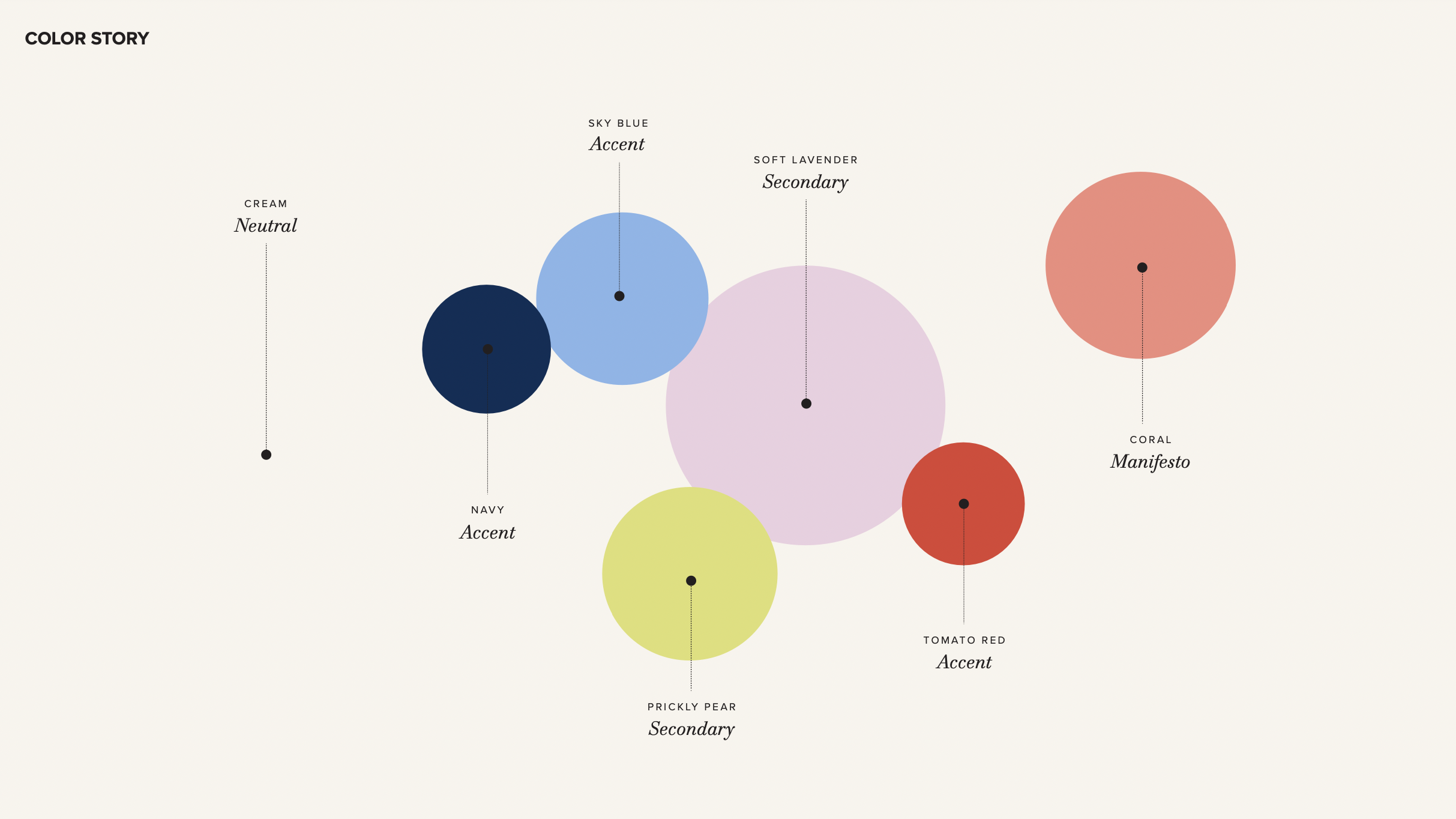
Rather than trying to conceal the distinct color palette of the George R. Brown Convention Center in Houston, Texas, I infused the site’s patriotic colors with some of the most popular, vibrant colors from the new Rodan + Fields’ brand palette – including their latest product innovation’s signature color – and amplified the feeling of celebration that successfully anchored the Rodan + Fields’ 15th birthday campaign with stripes of glitter and dashes of glitz.


To play off of and contemporize the space’s iconic 60’s-era graphic details I used image- as-pattern and explored the playful space where graphics and messaging typography meet. Declarative and directional signage becomes social-forward photo opportunities. Supportive digital collateral unlocks a fresh world of teaser and activation opportunities to support both pre- and post-convention momentum.


